Hill Climb Racing Lets the Road Teach You How to Drive

Hill Climb Racing
The first time a hill throws my driver into the air, the game makes its point without a tutorial: I have pressed too hard, and the landing is mine to fix. Hill Climb Racing is built around that unusually direct conversation between player and terrain. Its design is strongest when it lets the landscape explain what to do, and weakest when menus and upgrade prompts interrupt that conversation. The result is a remarkably legible arcade game whose best interface is often the road itself.
A game that teaches through motion
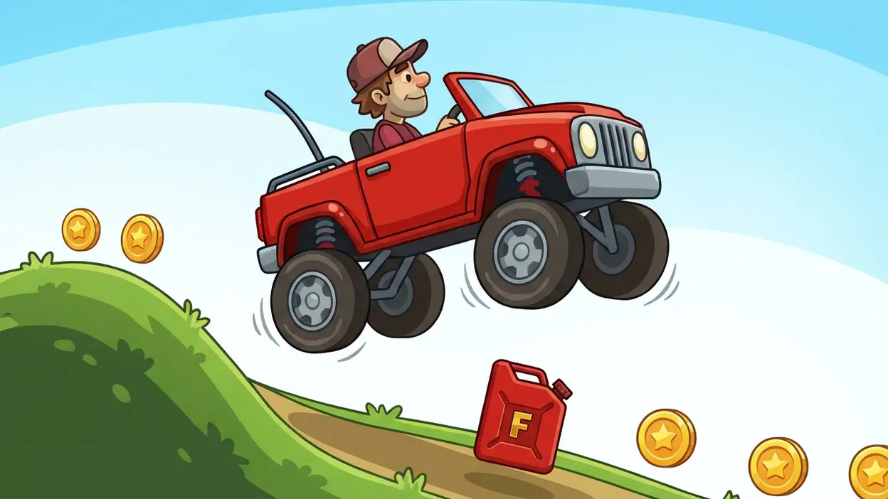
At its core, this is a side-on driving game with a simple wager. Hold the right pedal to accelerate, use the left pedal to brake or reverse, and try to keep the vehicle upright while collecting coins and covering distance. The controls are easy to understand before the first run ends. Mastering them is another matter: a steep slope, a sudden dip, or one careless burst of throttle can turn a promising climb into a spectacular face-plant.

Hill Climb Racing
Fingersoft · 4.3 · Free · Android, iOS

Race Master 3D: Car Racing
4.6 · Free

Extreme Car Driving Simulator
4.3 · Free

Asphalt 8 - Car Racing Game
4.6 · Free
That gap between easy input and demanding judgment gives the game its rhythm. A run begins with confident acceleration, then asks for little corrections as the ground rises and falls. Coins tempt you into risky lines; fuel cans make distance feel urgent; a landing can rescue a run or end it. Each attempt is short enough to invite another, but expressive enough to make failure feel like a specific mistake rather than a random punishment. The design does not need a complicated control scheme because the terrain keeps changing the meaning of the same two actions.
First-use orientation
The opening is unusually efficient. A vehicle, a stretch of ground, and two large pedal controls communicate the essentials at a glance. There is no need to decode a cockpit full of gauges before moving. The rider’s body also works as a readable indicator: when the vehicle pitches upward or tips toward its roof, the danger is visible in the same place as the action.
This is good onboarding by demonstration. A new player can try the pedals, see the vehicle respond, and infer that balance matters. The game does not need to explain every consequence in advance; the first awkward landing supplies a better lesson than a paragraph of instructions would. The trade-off is that the first run can feel abrupt if a player expects a gentler introduction. A brief, optional hint about feathering the accelerator could help without slowing down the people who already understand the joke.
Navigation and hierarchy
The driving screen has a clear visual hierarchy: vehicle and terrain dominate, controls sit within thumb reach, and collectible or survival cues appear where they matter. That ordering is sound because the player’s immediate question is not “What can I unlock?” but “Can I clear this rise without flipping?” The game keeps the answer visible in the movement of the vehicle and the shape of the next hill.
Between runs, however, attention is divided among vehicle selection, upgrades, stage choices, currency, and prompts to continue improving. These are useful layers, but they compete more than the driving screen does. The core action feels almost self-explanatory; the surrounding economy asks players to learn which resource belongs to which decision. Newcomers can work it out, yet the menu hierarchy does not have the same clean inevitability as the controls.
That contrast matters because progression is not a side activity. Coins gathered during a run feed upgrades and new vehicles, so the game repeatedly moves the player from physical skill to menu decisions. The best flow is when a failed run has a clear next step: improve a relevant part, choose a stage, and try again. When several upgrade choices present themselves at once, the next step is less obvious, and the game briefly feels like a shop attached to a driving toy.
Feedback after actions
On the road, feedback is immediate and unusually physical. Pressing the accelerator changes the vehicle’s pitch and speed; tapping the brake can steady a descent or pull the car back from a bad angle. A collision, rollover, or safe landing is legible without a text explanation. Even a small adjustment feels meaningful because the terrain gives it a visible consequence within seconds.
Reward feedback is similarly easy to read. Coins appear along the route as both a prize and a dare: collect them if the angle is safe, leave them if the jump is already going wrong. Fuel pickups are more urgent because they change the run’s remaining horizon. This is a neat hierarchy created through context rather than an elaborate tutorial. The same object can be worth pursuing or avoiding depending on the slope, speed, and fuel gauge.
After a crash, the end-of-run moment does useful editorial work. It turns a messy sequence into a result the player can assess, then points toward another attempt or a possible improvement. Still, repeated prompts to spend or upgrade can make the feedback feel transactional. The emotional beat of “I nearly made it” is strongest when the game lets that thought land before it asks for another decision.
Friction and recovery
The game is forgiving in a productive way. Runs are short, restarting is easy, and failure rarely demands a long walk back through menus. That keeps experimentation cheap. I can try a cautious approach, overcorrect on the next hill, then immediately test a smoother throttle rhythm. Recovery is not merely a button; it is the short distance between understanding a mistake and having another chance to act on it.
There is a less generous side to the progression loop. Early upgrades can make the vehicle feel more capable, but menus sometimes leave the player to decide whether to improve power, grip, suspension, or another part without making the practical difference especially clear at the moment of purchase. The consequences become apparent through play, which suits the game’s learn-by-doing character, but it also means a scarce pile of coins can be spent on an upgrade that does not solve the problem the player actually has.
Recovery from that kind of decision is slower than recovery from a crash. The player can earn more currency and adjust course, but the interface could do more to connect an upgrade to the handling problem it addresses. A concise preview of how a part affects climbing or stability would support informed experimentation without taking control away from the player. The game’s strongest teaching method is observation; its menus could borrow more of that clarity.
Consistency across the experience
The fundamental visual language remains consistent: vehicles, riders, slopes, and pickups are drawn in a bold, cartoon style that favors recognition over fine detail. That restraint helps the screen stay readable as the action gets rough. The world is not trying to simulate a realistic dashboard. It wants the player to notice tilt, speed, and the next change in elevation.
The interaction language also holds together around short, reversible decisions. Tap, steer through a pitch change, recover, and try again. Vehicle choice and upgrades add complexity, but they still serve the same basic question: how will this machine behave on the next stretch? The less consistent moments arrive when the game shifts from that tactile logic to denser progression screens. There, the player’s attention moves from “read the ground” to “compare several abstract choices,” and the change in mental mode is sharper than it needs to be.
Small-screen decisions
This is a natural fit for a phone because the action asks for very little finger choreography. Two broad controls are easy to reach, and the game’s side view keeps the route understandable without asking the player to pan a camera or manage a cluster of buttons. A run can be enjoyed in a short pause, yet the visible terrain ahead gives enough warning to make a careful player feel in control.
The simplicity has a cost: both pedals demand attention at once when the vehicle is airborne or landing, and the player has to make fine timing decisions with only those two inputs. That is not a flaw so much as the game’s chosen constraint. It turns a small screen into a useful instrument, not a miniature console packed with controls. The interface succeeds because it reserves space for the thing that matters most: seeing what the vehicle is about to hit.
What experienced players notice
After the novelty of flipping over wears off, the game becomes a study in restraint. Experienced players are not simply holding down the accelerator harder; they are learning when to release it, when to brake in midair, and how to approach a crest so the vehicle lands on its wheels. The controls stay fixed, but their timing becomes more expressive. That is a strong form of depth: skill comes from reading the same visual language more accurately.
Progression can either support or blur that learning. A better-equipped vehicle may make a stage manageable, but it can also hide a weak technique by giving the player more margin for error. Conversely, a stubborn climb can make an upgrade feel like the obvious answer when a gentler throttle would do. The game leaves room for both interpretations, and that ambiguity creates replay value. The player is always testing whether the obstacle needs a better machine or a better decision.
Long-term play also depends on the pleasure of self-correction. A distance record is satisfying, but so is recognizing the exact moment a run began to unravel and responding differently next time. That small loop of diagnosis and adjustment keeps the game lively well beyond its basic controls. The design trusts the player to turn a crash into information.
The choice that works best
The strongest design choice is the decision to make vehicle balance the center of the experience. It gives the road a voice. A sharp incline asks for power; a drop asks for composure; a jump turns the rider’s tilt into a countdown to the landing. Because the feedback is visual, immediate, and tied directly to the player’s thumbs, the game can stay playful without making its challenge feel arbitrary.
That principle also explains why the simple control layout lasts. The interface does not need to invent a separate action for every surface or obstacle. It lets a small set of inputs produce different outcomes as speed and terrain change. In a crowded mobile game, that kind of economy is easy to underestimate. Here, it is the difference between a novelty that wears off and a loop players can keep refining.
A clear design verdict
Hill Climb Racing understands that a good mobile interface is not always the one with the most guidance. On the road, it gives the player enough information to act and lets consequences do the teaching. Its short runs, generous restart rhythm, and readable vehicle physics make failure easy to accept and improvement satisfying. The design feels confident because it keeps the important feedback close to the player’s action.
Its weaker moments sit around the drive rather than inside it: progression screens can crowd the next decision, and upgrade choices could explain their practical value more clearly. Those are real points of friction, especially for a new player trying to understand why a run keeps going wrong. They do not erase the central achievement. This is a compact, memorable example of interaction design built from motion, consequence, and quick recovery. The road teaches well; the menus would benefit from listening to it.