 Article about Lyft
Lyft Makes Letting Someone Else Drive Feel Routine
AppCompare
There is a particular kind of modern pause before a journey: standing at the curb, checking the map, watching a small car inch toward your pin. The trip has not started, yet much of its emotional work is already done. You have decided not to drive, negotiated with distance, and handed the first move to an interface. Lyft is a piece of infrastructure that feels personal precisely because it makes dependence look routine. Its cultural force lies less in the ride itself than in how naturally it fits into the gaps between plans.
Used carefully, the app is straightforward: enter a destination, compare the available ride options and estimated prices, request a driver, then follow the pickup and trip on the map. That familiar sequence carries a larger promise. The city can be treated as something you summon across, rather than a place whose transit schedules, parking rules, or weather you must work around. The promise is convenient, but it also changes what inconvenience means.

Lyft
Lyft, Inc. · 4.8 · Free · Android, iOS
A city made available on demand
What Lyft says about now is that access often matters more than ownership. A person can leave a car at home, skip the search for parking, or make a late connection without planning the entire evening around a fixed timetable. For a visitor, the app can make an unfamiliar city feel legible. For a local, it can turn a familiar trip into a decision made at the last minute. Mobility becomes less a possession than a service briefly called into being.
That shift depends on a quiet division of labor. The passenger names a destination and chooses among options; the driver supplies the vehicle, attention, and local navigation. The app translates between them with pins, estimates, status updates, and payment. Its clean order can make a complicated human exchange feel almost frictionless. Yet the ride still takes place in a real car, with a real person at the wheel, in traffic neither side controls. The interface organizes uncertainty; it does not abolish it.
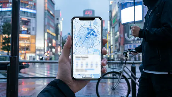
The design is strongest when it answers immediate questions without demanding much thought. Where is the driver? How long might the pickup take? Which ride option fits this trip? Those details matter more than a grand feature list when someone is waiting outside in rain or trying to leave a crowded venue. The map is not decorative scenery. It is the shared reference point that lets passenger and driver coordinate a meeting in a city full of moving parts.
The behavior the app makes ordinary
Repeated use turns the ride request into a small ritual. A person checks the address, confirms the pin, scans the arrival estimate, and waits with the screen in hand. On a night out, that sequence may happen at the door before coats are on. At an airport, it follows baggage claim. After work, it can be the last practical decision before the evening begins. The app makes waiting feel like an active task. Instead of simply standing still, the passenger monitors movement and anticipates the next step.
That habit has a particular rhythm: request, watch, recognize, enter, rate. The app keeps the trip present even before the car arrives, then fades into the background once the journey is underway. This is useful stickiness rather than endless engagement. Nobody opens a ride-hailing app to browse for pleasure. People keep it close because the next need may be urgent, ordinary, or awkward to solve on foot.
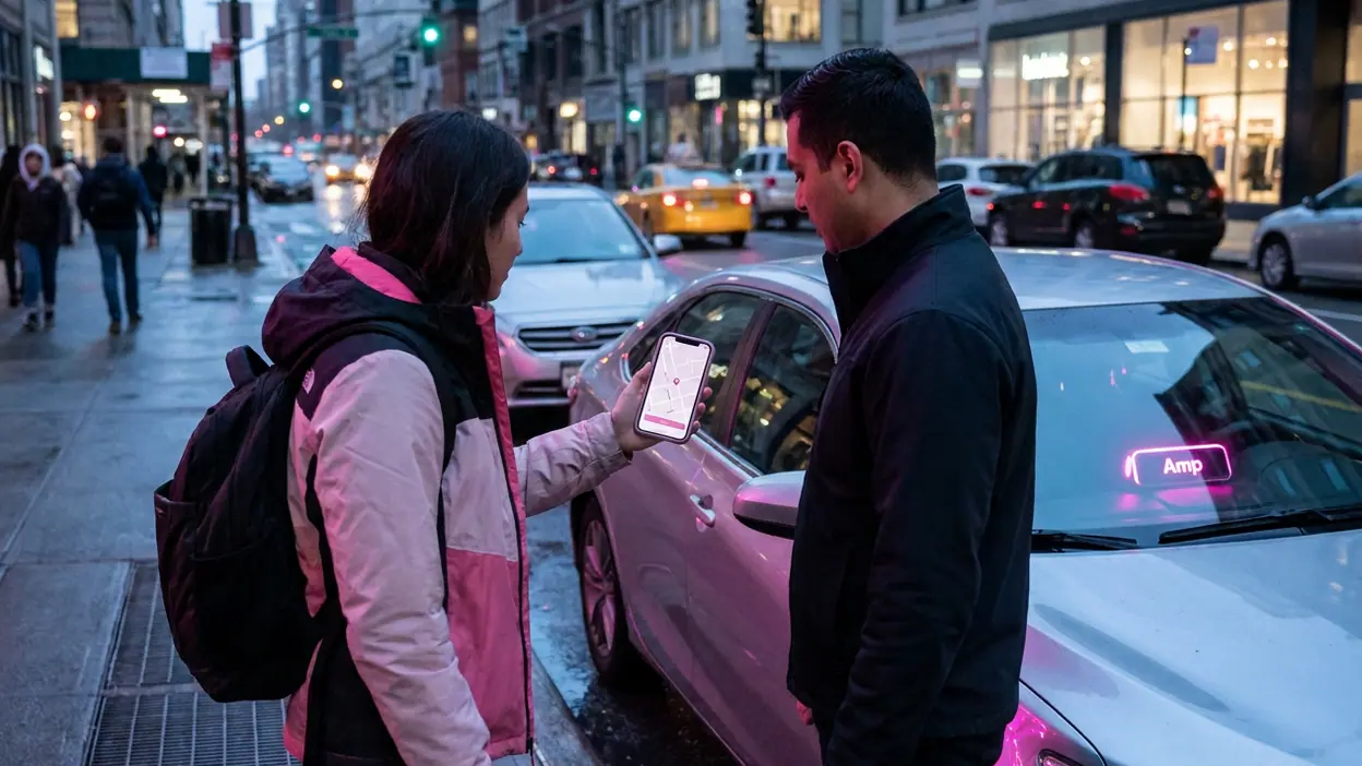
There is also a social script embedded in the pickup. The passenger checks a vehicle description, looks for a driver, and confirms that both people have found the same point. The screen supplies a little confidence before two strangers share a car. That reassurance is valuable, but it can make safety feel like a solved interface problem when it is not. Clear trip details help people coordinate; they cannot guarantee how a ride will feel or unfold.
Convenience as a signal
Choosing a ride can signal more than a preference for comfort. It may say that time is scarce, the weather is bad, public transport is inconvenient, or a night has gone on longer than expected. In some settings, ordering a car is treated as a small luxury; in others, it is the practical choice that makes a shift, appointment, or flight possible. The same tap can communicate status or necessity, depending on who is using it and what alternatives are available.
That ambiguity is part of the app's appeal. Lyft does not require the passenger to explain why the trip matters. A destination and a pickup point are enough to begin. But the ability to summon a ride depends on things the screen cannot level: local coverage, ride prices, the supply of drivers, and a passenger's ability to pay. Convenience is presented as personal choice, while its availability is shaped by infrastructure and income.
Price estimates and ride categories give users a degree of control, but the final experience remains exposed to changing conditions. A busy period can make a routine trip feel expensive; traffic can stretch a short route; a pickup point may be harder to reach than the map suggests. The app is most convincing when it makes those trade-offs visible early. It is less persuasive when the neatness of the flow encourages the impression that cost and timing are fixed promises.
How it fits around the day
For many people, the app lives on the phone less as a daily destination than as a contingency plan. It belongs beside the map, the calendar, and the payment app: not necessarily opened every morning, but reassuring to have available. This is a distinct kind of loyalty. The product does not need to occupy a user's attention constantly; it needs to be ready at the moment a plan becomes inconvenient.
That role brings Lyft into routines shaped by other people. A ride home after dinner, a pickup arranged for a family member, or a trip to a station can all involve coordination beyond the passenger holding the phone. The app is a tool for turning a vague promise of help into a specific car, place, and estimated arrival. Its utility is therefore social as well as logistical: it helps people make plans that would otherwise require a ride from a friend, a borrowed vehicle, or a longer wait.
There is relief in that independence, especially when asking someone for a favor would feel burdensome. There can also be a subtle change in expectations. Once a car appears to be only a few taps away, distance starts to feel more negotiable, and waiting for a bus or arranging a lift can seem unnecessarily complicated. The convenience is real; so is the way it redraws the boundary between a manageable trip and a frustrating one.
Where the interface reflects its moment
The app's visual language belongs to a broader culture of live status. Moving cars, arrival estimates, route lines, and trip details turn a journey into something legible at a glance. These cues answer a basic modern anxiety: not simply whether something is happening, but where it is and how soon it will reach you. Food delivery, parcel tracking, and ride-hailing all draw on this same appetite for visible progress. Lyft applies it to a person and a vehicle moving through public space.
The map also shifts responsibility in a subtle way. Once a passenger can see the car approaching, they are expected to be ready at the curb. The shared location helps both sides, but the passenger becomes part of the coordination system: watching, moving, and trying to meet the vehicle at the right moment. The interface does not merely describe the pickup; it trains both people to perform it efficiently.
When the system works, its best design achievement is restraint. The passenger does not need to understand dispatch or routing algorithms to get a ride. The sequence puts the actionable details in front of them and lets the machinery stay mostly invisible. That simplicity is not the same as simplicity underneath. It is a polished surface over a service that relies on drivers, demand patterns, road conditions, and the accuracy of a pin dropped on a messy street.
The uneasy parts of the promise
Some of Lyft's friction is ordinary but consequential: the pickup point is wrong, the driver is delayed, a fare feels steep, or the car cannot stop where the map suggests. In those moments, the app's confidence can feel out of step with the street. A digital estimate offers orientation, not certainty, and a tidy trip screen cannot make an awkward curb safe or accessible. The passenger still has to judge the surroundings and communicate when plans change.
There is a wider unease in how effortless the exchange appears. A ride request can look like a clean transaction between a customer and a screen, even though its convenience rests on a driver's time and work. Ratings and service prompts compress that encounter into feedback mechanisms. They can help set expectations, but they also encourage people to evaluate a human interaction through the quick categories an app can collect. The car arrives as a service; the labor that made it arrive is easy to overlook.
Nor does tracking amount to trust by itself. Knowing where a vehicle is can reduce uncertainty, but it may also teach users to expect constant visibility as the price of feeling safe. That is an understandable bargain in a ride with a stranger, yet it reveals how much digital life now asks for reassurance through data. The map calms the wait partly because it turns another person's progress into something measurable.
The pattern rivals share
Other ride-hailing services follow much the same grammar: choose a destination, see a price or estimate, match with a driver, track the car, pay through the app. That resemblance is not a failure of imagination so much as evidence that the pattern solves a real coordination problem. The category has converged on a common ritual because passengers want the same essentials: a clear pickup, a credible estimate, and a way to know the ride is underway.
The pattern also resembles habits found in apps far removed from transportation. Delivery services make waiting visible; fitness trackers turn activity into a record; puzzle games build repeat visits around compact tasks. Those comparisons sharpen the point rather than equate the products. Lyft's repeat use is grounded in practical need, not a streak or a level. Its habit loop is the promise that a future inconvenience can be handled quickly, and that promise has value even when the app stays closed.
Lyft's identity, then, is not defined only by what appears on the screen. It is shaped by the familiar colors, the recognizable ride flow, and the expectation that a car can be coordinated through a phone. Rivals may copy the mechanics, but the wider culture has already adopted the underlying behavior: place a request, watch the service approach, and fit the journey around the rest of life.
That is why Lyft earns a place in the pocket without needing to become a passion. It is a tool for moments when a person wants the city to meet them halfway, and a reminder that convenience is never purely digital. The app can make a ride feel immediate, personal, and easy to arrange; the street, the driver, the fare, and the wait remain stubbornly real. Its cultural achievement is not that it makes travel effortless. It makes asking for movement feel ordinary.