 Article about Google Maps
Google Maps Gets You There, Until the Map and the Moment Disagree
AppCompare
The hardest part of using a navigation app is not finding a route. It is deciding what to trust while the street is moving around you: the blue line, the sign overhead, the turn you may already have passed. Google Maps is unusually good at turning that uncertainty into a next action. Its design thesis is simple and effective: keep the destination in view, keep the immediate instruction legible, and let the map absorb most of the complexity. The cracks appear when those layers compete, or when the app cannot tell whether you need reassurance, a correction, or silence.
Orientation before action
Open the app and the first screen is not a menu so much as a compact picture of your surroundings. The map occupies the space, a search field sits within easy reach, and familiar shortcuts suggest common errands without demanding a setup ritual. That arrangement makes sense on a phone: many trips begin with a place in mind, not a desire to browse settings.

Google Maps
Google LLC · 3.2 · Free · Android, iOS
For a first-time user, the screen communicates two useful facts quickly: where you are, and how to ask for somewhere else. The current-location marker gives an immediate anchor, while the map’s roads and labels provide enough context to recognize a neighborhood. Search suggestions can shorten the path from intention to action, though they also make the starting screen feel busier than a simple map needs to be. Recommendations are helpful when you are exploring; they are visual competition when you are late and just want an address.
That is the first revealing design trade-off. Google Maps treats orientation as both a practical task and an invitation to discover. Most of the time, the two fit together. A nearby cafe or saved place can be a useful prompt. But the interface asks users to distinguish between map information, suggested destinations, and controls at a glance, before they have even begun a journey.
Navigation and hierarchy
Route planning is where the hierarchy becomes clearest. Enter a destination and the app places route options over the map, with estimated time and mode giving each choice a quick identity. Once navigation starts, the interface changes its priorities: the next maneuver grows prominent, the route line becomes the visual spine, and secondary information recedes. This is good interaction design because it reflects the user’s changing question. Before departure, “Which way?” matters. On the move, “What do I do next?” matters more.
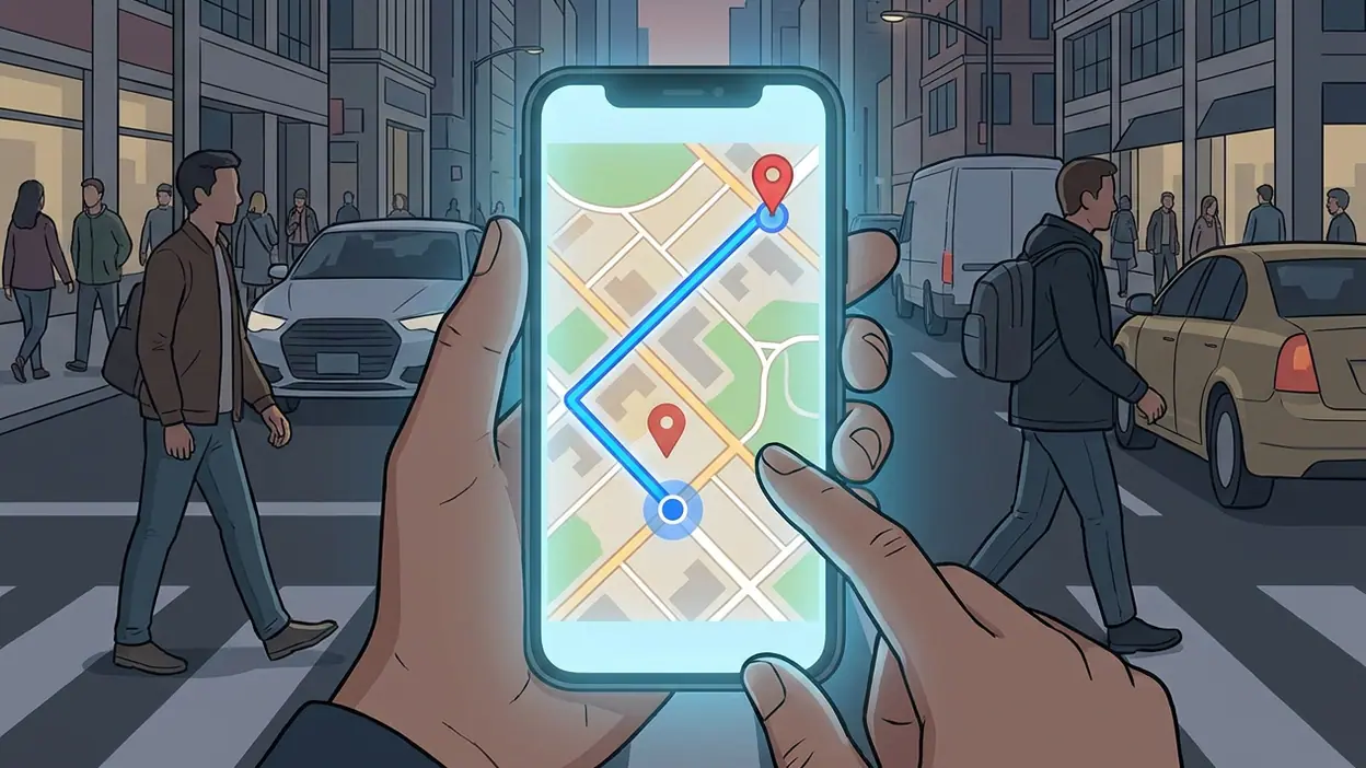
The blue route line is a particularly strong anchor. It persists through turns and visual clutter, so the user does not have to reconstruct the plan from a list of street names. The next instruction arrives in plain language, paired with a directional cue. I find this useful even on familiar streets: a quick glance can confirm that the coming turn is the one I expected, without requiring a full read of the map.
But the hierarchy is not infallible. In a dense urban area, labels, route alternatives, transit lines, business markers, and traffic colors can crowd the same patch of screen. The map is rich because it is useful, yet that richness can make the important path harder to isolate at precisely the moment a driver or pedestrian needs a fast read. Navigation mode helps by reducing some of that visual noise, but the transition from exploratory map to focused guidance is not always as clean as the design intends.
Modes also change what “the route” means. Driving, walking, cycling, and transit each demand different context, and the app generally makes the selected mode visible before guidance begins. Transit directions are especially dependent on sequence: reach a stop, board the right service, change if needed, then walk the final stretch. A route card can communicate that chain, but users must still scan several steps and keep their place. The interface is strongest when it presents one immediate action; it is less effortless when the journey is a small itinerary.
Feedback that earns trust
Good navigation feedback is not just a turn instruction. It is the steady confirmation that the app understands what is happening. The location marker moves with the journey, the route advances, and the remaining distance changes. When a turn is near, the instruction becomes more urgent through placement and timing rather than a dramatic interruption. That restraint matters: a navigation app should compete for attention only when there is something useful to say.
Voice guidance extends that principle beyond the screen. It lets a driver keep eyes on the road and gives a pedestrian a reminder without requiring a prolonged glance. The app’s feedback is most persuasive when spoken directions, visual cues, and the physical street agree. A clear instruction followed by a visible turn creates a small but valuable loop: hear, recognize, act, confirm.
That loop can wobble in complex junctions. A short instruction may name a street while the real decision involves several lanes or a sequence of closely spaced exits. Looking at the map then becomes necessary, and the user has to reconcile a simplified spoken cue with a more complicated scene. The app provides plenty of information, but more information does not always mean better feedback. Sometimes the missing piece is a sharper explanation of which side of a divided road, ramp, or station entrance to use.
Arrival is another small test of trust. Reaching the destination ends the route, but it does not necessarily end the task. A large complex may have multiple entrances, a building may sit behind a block, and a pin can be close without being practically useful. Google Maps is confident about the destination as a point; people often need it as a place with an accessible door.
Friction, recovery, and consistency
Every route app will eventually be wrong about where you are, or wrong about what you should do next. The important design question is whether recovery feels like a failure. Here, a missed turn usually leads to recalculation rather than a scolding or a dead end. The route changes and guidance resumes, which lowers the cost of a mistake. That is a strong choice: navigation should make correction ordinary, because hesitation and missed turns are ordinary too.
Recovery is less comfortable when the user cannot tell why the route changed. A reroute may be sensible, but a sudden new line can feel like the app has quietly replaced one plan with another. In motion, there is little time to compare alternatives or inspect the cause. Clearer feedback about a meaningful change would help users decide whether to follow the new route or stick with what they know.
Consistency is generally one of the app’s strengths. Search, place details, route planning, and turn-by-turn guidance share enough visual language that the user can move between them without learning a new product each time. The map remains the central reference, and the blue route continues to mean forward progress. Yet the experience contains several kinds of panels and cards, each with its own density and gestures. A place card may invite a swipe, a route sheet may expand, and a navigation control may be tucked into a different corner. These are reasonable patterns individually, but together they reward familiarity more than intuition.
That distinction matters because the app is often used under pressure. A person on foot may be carrying a bag, waiting for a crossing signal, or trying to keep pace with a group. A driver may be unable to touch the screen at all. The interface cannot make every interaction effortless, but it can avoid asking the user to remember where a secondary control went. The most important actions remain comparatively easy to find; less frequent adjustments take more exploration.
The small-screen bargain
On a phone, Google Maps has to make a whole city legible through a window only a few inches wide. Its answer is to let scale and emphasis do much of the work: the route thickens into a clear line, the next turn receives space, and the map can be rotated to match the direction of travel. These choices reduce the mental translation between screen and street. Instead of imagining how a north-up map relates to the road ahead, the user can follow a view that points roughly the same way they are moving.
The bargain is that less of the surrounding world remains visible. Zooming out restores context but makes the next maneuver less precise; zooming in clarifies the immediate street while hiding what comes after it. The app manages this tension well during ordinary navigation, yet users still have to glance between local detail and overall route. A larger screen would make the task easier, but the mobile design mostly understands what it cannot show at once.
Small controls and crowded map labels remain the cost of packing so much utility into one surface. At a glance, the route is clear; at a stop, refining it or checking a place detail can require more careful tapping. This is why the interface feels best when it anticipates the task and worst when it turns a quick correction into a touch-precision exercise.
What experienced users notice
After many journeys, the app becomes less a set of features than a familiar choreography: search, compare, start, glance, correct. Experienced users learn where the next maneuver tends to appear and how the map behaves when they drift from the route. That fluency is useful, but it can conceal a design weakness. A control that feels obvious after months of use may not be obvious to someone who has just installed the app or has switched from another navigation tool.
Regular users also notice how much context sits behind a simple destination search. A place is not merely a label; its details can help answer whether it is open, where it sits, and whether the pin matches the entrance they need. This turns Google Maps into a planning tool as well as a navigation tool, and explains why people return to it even when they already know the way. It is sticky because it supports the entire arc of an outing, from choosing a destination to checking the last turn.
The design challenge is that those extra jobs are not equally urgent. Planning invites browsing, while active navigation punishes distraction. The app does a credible job of shifting emphasis between the two, but its broad scope means the map never becomes completely free of competing information. A specialist navigation interface could be quieter. Google Maps chooses breadth, and experienced users learn to filter its abundance.
The strongest choice, and the verdict
The strongest design choice is the app’s commitment to making the next useful action visible without hiding the larger journey. The route line, current position, and upcoming maneuver work as a compact system: one shows the plan, one shows the present, and one explains what to do now. That arrangement turns abstract directions into a readable conversation between the screen and the street. It is why the app can feel calm even when the surrounding city is not.
Its weaknesses follow from the same ambition. Google Maps wants to help users explore places, compare routes, understand transit, and move through unfamiliar streets, all on a small screen. That breadth creates clutter, makes certain changes harder to interpret, and sometimes treats a mapped point as if it were the same thing as a usable arrival. The fixes are not glamorous: clearer route-change explanations, less competition around the active path, and more precise arrival guidance would improve real journeys more than another layer of suggestions.
As an interaction design, Google Maps succeeds because it treats uncertainty as part of travel rather than an edge case. It gives users a strong visual anchor, sensible feedback, and a forgiving way back when they miss a turn. It does not eliminate the mental work of navigating, especially in crowded streets or multi-step transit trips, but it makes that work manageable. My verdict is that it remains an excellent everyday guide, not because every screen is quiet, but because the most important moment usually has a clear answer: what to do next.