 Article about Google Photos
Why Google Photos Feels Smarter When Your Library Gets Messy
AppCompare
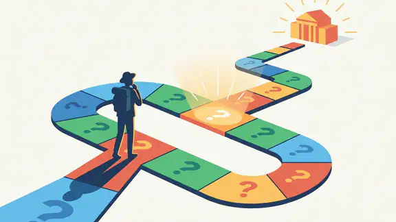
A photo library becomes difficult long before it becomes full. The real problem is not storage; it is orientation. Years of screenshots, receipts, portraits, trips, downloads, and accidental duplicates create a visual archive that can feel more like a drawer than a collection. Google Photos succeeds because it treats that disorder as a navigation problem first and a photography problem second. Its strongest design decisions help me answer three simple questions quickly: where am I, what can I do here, and how safely can I undo it?
That sounds modest, but it is a demanding brief. A photo app has to serve the person who wants to find a picture from last summer, the person who wants to edit a single image before posting it, and the person who suddenly realizes that an entire folder may have been backed up. Google Photos is at its best when it reduces those moments to clear visual choices. It is less convincing when its intelligence becomes too eager, its suggestions compete for attention, or its cloud-first logic makes local ownership feel less obvious than it should.

Google Photos
Google LLC · 4.4 · Free · Android, iOS
Design thesis
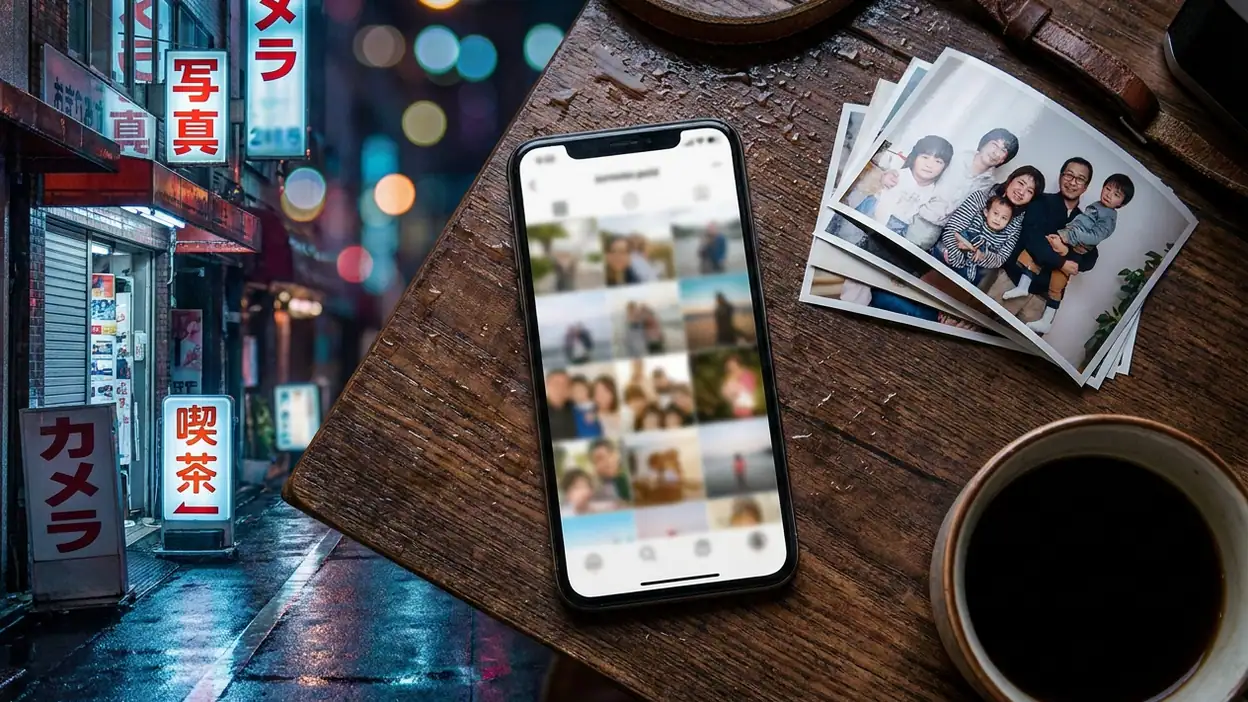
The central design idea is that a personal archive should organize itself around human memory rather than file management. Instead of asking me to remember folder names, filenames, or exact dates, Google Photos presents a stream of visual evidence and adds several routes into it: time, people, places, objects, albums, and search. This is a sensible response to the way most people recall photographs. I rarely remember the name of a file, but I may remember that it was taken near the coast, contained a dog, or belonged to a particular weekend.
The app also understands that organization is not a one-time task. It keeps offering ways to improve the archive after the fact, through automatic groupings, suggested edits, shared collections, and memories. That makes the product sticky without requiring constant manual maintenance. The trade-off is that the interface can occasionally feel as if it is interpreting my library on my behalf. The design works best when those interpretations remain invitations rather than instructions.
First-use orientation
The first launch is a negotiation between reassurance and commitment. Google Photos wants access to the camera roll, wants to explain backup, and wants me to understand that the library may live across devices. That sequence matters because permission screens are not just administrative obstacles here. They define the relationship between a phone and a remote archive.
On a recent setup, the app made the broad path easy to understand: allow access, choose backup behavior, then arrive at the library. The visual language is familiar and relatively calm, which helps. I do not feel dropped into a dashboard full of competing cards. The photo grid becomes the main event quickly, and that is the right decision. A photo app should demonstrate its value through my images rather than through a tour of its controls.
Still, first-use orientation is not perfect. Backup choices can carry consequences that are larger than their compact presentation suggests, especially around image quality, mobile data, account storage, and the difference between seeing an image in the app and having an original safely backed up. A confident user can move through these choices quickly, while a cautious user may need to pause and inspect the wording. The app could do more to explain the practical outcome in plain language without turning the setup into a lecture.
The strongest onboarding moment arrives after the library appears. Even with a modest collection, the grid immediately communicates continuity: these are not sample assets, but my photographs, arranged into a living record. That direct proof is more persuasive than any welcome message.
Navigation and hierarchy
Google Photos uses a hierarchy that feels obvious after a few minutes but reveals careful prioritization underneath. The main library remains the visual anchor, while search and collection-oriented areas provide alternate ways in. This prevents the app from becoming a folder browser. The grid says, “look through time,” while search says, “describe what you remember.”
The library view is especially effective because it makes chronology legible without overexplaining it. Dates and grouped periods give me enough structure to scan, while the photographs retain visual dominance. I can move quickly through months, stop at a familiar scene, and open it without first passing through a chain of nested folders. That speed is more important than it sounds. A photo library is often used in short bursts, such as finding an image during a conversation, and every extra layer feels expensive.
Search is the more ambitious part of the hierarchy. It is not merely a field for filenames; it acts as a parallel index built from visual and contextual signals. Searching for a place, subject, or event can be more natural than navigating an album structure. When it works, the result feels almost conversational, although the experience remains grounded in a conventional list of images rather than pretending to be a chat interface.
Collections and albums introduce a different kind of order. They are useful for deliberate groupings, but they can also expose a mild tension in the product. Automatic organization and manual organization overlap, yet they do not always explain their relationship. I may know that a photograph appears in my main library, an album, a shared space, and a generated memory, but the interface does not always make those connections equally visible. Google Photos is good at finding an image; it is less consistently good at teaching me why that image appears in several places.
Compared with a utility such as Google Drive, which foregrounds files and folders, Google Photos is more forgiving of incomplete knowledge. Compared with PayPal, whose task structure is mostly transactional, it has to support wandering, browsing, and emotional recall. That difference explains why its navigation feels less like moving through documents and more like moving through a personal landscape.
Feedback after actions
Good interaction design becomes visible immediately after a tap. When I edit a picture, save a change, add an image to an album, or remove something from the main view, the app needs to confirm the result without interrupting the flow. Google Photos generally handles this well through subtle state changes, brief confirmations, and the persistent presence of the image itself.
Editing is a useful example. The controls are arranged around a familiar sequence: adjust the image, apply a crop or filter, then save or preserve the original. The preview does most of the explanatory work. Rather than forcing me to understand a technical model first, the app lets me see the consequence of a slider or tool directly. That immediate visual feedback makes the editor approachable even when the underlying operations are sophisticated.
Saving is also handled with a reassuring sense of finality. The image changes in place, but the app usually preserves a route back to the earlier version. That matters because photo editing is a high-confidence activity with low-confidence judgment. I may know exactly how to brighten a shadow, yet remain uncertain whether I have gone too far. A recoverable edit lets me experiment instead of treating every adjustment as permanent.
Selection behavior in the library is less elegant. Choosing multiple images can change the top-level controls and create a denser action state, which is normal for a mobile interface, but the transition is not always as calm as the browsing state. The app has to expose sharing, archiving, deletion, editing, and organization tools in a small space. The result is functional, though users who rarely perform batch actions may need a moment to decode what has appeared.
The app is strongest when feedback remains proportional. A completed backup or edit should not require a dramatic interruption; a destructive action deserves more visibility. Google Photos usually understands that distinction, although the exact prominence of feedback can vary depending on the operation and device.
Friction and recovery
Every large photo library contains mistakes. I have selected the wrong image, archived something I still needed, started an edit that did not work, and searched with a description too vague to produce useful results. The quality of Google Photos is therefore measured not only by how quickly it helps me act, but by how gracefully it handles my errors.
Recovery is strongest around editing. The ability to revisit an image and restore an earlier version lowers the emotional cost of experimentation. It also communicates a clear product philosophy: the app is willing to let me try. That is a better form of confidence than simply hiding complexity.
Deletion is more complicated because the app participates in a cloud-backed system. The meaning of removing an image can depend on whether it is deleted from the device, removed from the library, or placed in a trash area awaiting permanent removal. The product does provide recovery paths, but the mental model can require attention. A user may reasonably ask, “Am I deleting this everywhere, or only hiding it here?” The interface should answer that question at the moment of action, not after regret appears.
Shared content creates another layer of friction. A photograph may belong to my library while also being visible through a shared album or partner arrangement. That flexibility is valuable, but it makes ownership and visibility harder to summarize. The app could benefit from more explicit language around who can see an item, where it is stored, and what changes when I remove it from a shared context.
Search recovery is quieter but equally important. When a query fails, the app does not always teach me how to refine it. A blank or weak result can feel like a dead end even though the archive may contain the image under a different interpretation. Better suggestions, examples, or nearby categories would turn failed searches into guided recovery rather than silent disappointment.
Consistency across the experience
Google Photos maintains a recognizable visual grammar across browsing, search, editing, and sharing. Images remain the primary objects, controls tend to stay secondary, and familiar gestures carry across contexts. This consistency reduces the amount of interface language I have to learn.
There is also consistency in the app's attitude toward automation. Generated groupings, editing suggestions, and memory presentations are usually framed as things I can inspect rather than commands I must follow. That tone matters. The application behaves like an assistant that has prepared material, not an administrator imposing a filing system.
However, consistency becomes less certain when the app crosses from personal library to shared space. Personal ownership, collaborative albums, and automatically surfaced memories can look similar while carrying different consequences. The visual system does not always provide enough distinction between “this is in my library,” “this is shared with me,” and “this was surfaced because the system found a connection.” The images are consistent; the permissions are not always equally legible.
The relationship between mobile and web experiences is broadly coherent, which is important for an archive that people access across devices. Still, a feature can feel more discoverable on one platform than another because screen size changes the available hierarchy. That is not a failure of consistency by itself, but it means the product's mental model must survive different layouts. Google Photos mostly achieves that by keeping the library and search concepts stable.
Small-screen decisions
A phone screen forces Google Photos to choose between density and confidence. The app generally chooses density in the library, where a tightly packed grid helps me survey a large collection quickly. That is the right call for browsing, but it creates a risk: similar images can become visually interchangeable, and small thumbnails make careful selection harder.
The grid works because it turns the screen into a memory surface. I can skim without opening every image, and the rhythm of repeated thumbnails makes time feel navigable. Yet the same rhythm can encourage accidental taps, particularly when I am selecting several photographs or trying to distinguish near-duplicates. The interface depends on the image itself carrying enough information at thumbnail size, which is not always possible with dark scenes, documents, or visually similar bursts.
Full-screen viewing wisely removes most distraction. The photograph expands, controls recede, and the act of looking becomes primary. This is one of the app's most respectful decisions. It recognizes that a photo is not just an item to manage but an image to inspect.
Editing on a small screen is a more delicate compromise. Sliders and tool rows need to remain reachable without covering the preview, while advanced choices must be discoverable without crowding the initial view. Google Photos keeps the basic path approachable, but its deeper capabilities can require horizontal exploration and careful reading of icons. The design rewards familiarity, though newcomers may not immediately know which tools are simple corrections and which can substantially alter the image.
Bottom navigation and gesture behavior also shape the experience. The persistent routes help me return to the main areas without losing the larger mental map, but they compete with the desire to give photographs as much space as possible. Google Photos handles that tension better than many media-heavy apps because the navigation is quiet rather than permanently dominant.
Expert-user observations
After extended use, the most interesting details appear in the gaps between automatic and manual organization. An expert user learns to treat the main library as the source of truth, albums as intentional presentations, and search as an index that may reveal relationships I never created myself. That division is powerful, but it is not fully taught by the interface. I had to develop the model through repeated use.
Batch selection reveals another layer. The app is built for people who occasionally need to manage dozens or hundreds of images, yet the mobile form cannot expose every consequence at once. An experienced user learns to check the selected count, inspect the available actions, and pause before deleting or sharing. The interface supports that caution, but it does not always actively encourage it.
Storage behavior is equally important. Google Photos makes the archive feel available everywhere, but availability can blur the distinction between a cloud copy, a device copy, and an edited version. Users who care about originals, export quality, or long-term archiving need to look beyond the friendly surface. The product is excellent as an everyday library and less self-explanatory as a complete archival strategy.
There is also a cultural observation here. The app's automatic memories turn private photographs into recurring editorial packages. A forgotten weekend can return as a curated sequence, sometimes with a pleasing sense of surprise and sometimes with an awkward reminder that the system is making meaning from personal material. That feature is not merely decorative. It changes the emotional rhythm of the library by giving old images a second entrance.
Against Avatar World, which uses visual collections as part of an imaginative play space, Google Photos feels deliberately non-performative. It does not ask me to create a character or inhabit a designed world. Its job is to preserve evidence of my real one. That distinction explains both its calmness and its occasional lack of delight.
The strongest design choice
The strongest design choice is the decision to make the chronological library the default experience while allowing search to act as a second, semantic route through the same material. These two modes support different kinds of memory. The grid helps me recognize; search helps me describe. Recognition is often faster, but description is what saves the day when I know what I want and cannot remember when it happened.
This pairing also keeps the app from forcing a single organizational philosophy. I can browse passively, organize deliberately, or ask the system to interpret the archive. None of those behaviors has to replace the others. That flexibility is why the product remains useful after the novelty of automatic grouping fades.
More importantly, the choice respects the emotional nature of photographs. A folder structure implies that images are documents waiting for labels. A chronological stream allows them to remain memories first. The app still provides practical management tools, but it does not make administration the center of the experience.
Final design verdict
Google Photos is a strong interaction design achievement because it makes a complicated archive feel approachable without pretending that complexity has disappeared. Its hierarchy is clear, its visual feedback is usually well judged, and its editing workflow gives users room to experiment. The app understands that the most valuable action is often not taking a picture or applying a filter, but finding the right image at the right moment.
Its weaknesses are concentrated in the places where cloud storage, sharing, automation, and ownership overlap. The product can be too quiet about consequential choices, and its intelligent organization sometimes explains the result less clearly than it presents it. Users with serious archival needs should also spend time understanding backup quality, originals, device copies, and deletion behavior rather than relying on the reassuring simplicity of the main grid.
Even with those reservations, the design earns its place as a daily photo companion. It does not win by filling the screen with tools. It wins by giving a huge, messy collection a readable shape, then getting out of the way when the photograph itself matters. That is the clearest sign of maturity: the interface is most successful when I stop thinking about the app and start remembering why I kept the picture.